Sitka Landslide Risk Forecast
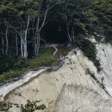
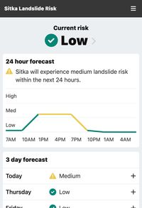
On August 18, 2015, a landslide in Sitka, Alaska killed three people, in addition to causing massive property damage. The community took action, collaborating with scientists and technologists to create a landslide risk forecasting application. Sitka Landslide Risk provides a live, hyperlocal forecast that helps Sitkans make critical daily decisions.
Client
My Role
At a Glance
- I was responsible for the entire design process, from discovery and data visualization to wireframes and high-fidelity mockups.
- I led an inclusive, user-centered process that incorporated perspectives and feedback from a diverse group of community stakeholders.
- I built an accessible web application using React and Next.js with a perfect Lighthouse performance score.
Stakeholder Workshop
To kick off the project, I led a remote workshop that convened key stakeholders, including staff from the science center, members of the Sitka Tribe, and meteorologists/geologists. Objectives included:
- Establishing a shared understanding of project goals
- Prioritizing user types
- Taking inventory of inventory of available data
- Evaluating existing risk websites using a rose, bud, thorn exercise
I closed the workshop with a co-creation session, giving participants an opportunity to design their own risk assessment models. This exercise helped resolve an earlier discussion about whether to use a numerical (e.g. 52%, 90%) or descriptive (e.g. low, high) system to indicate risk. During the exercise, the two strongest advocates of a numerical system ended up going in the other direction; going through the exercise helped them see the merits of the other approach.
User Interviews
I worked with the client to identify nine Sitkans who represented the users we prioritized during the workshop. This cohort included the Fire Chief, School Superintendent, City Administrator, and several members of the Sitka Tribe. I asked questions about how they currently learn about landslide risk, what kinds of decisions they make regarding landslide risk, and about their technology use.
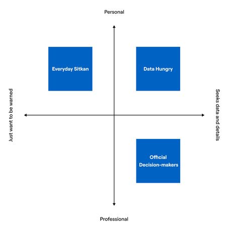
Mapping user needs along two spectrums: type of decision and level of detail.
From these interviews, two primary needs emerged:
- Type of decision: Were they making decisions for themselves/their family or were they making decisions on behalf of a larger group or institution?
- Level of detail: Did they “just want to be warned” or did they want to understand the data and model behind the risk score?
I used these needs to categorize users into three types: Everyday Sitkans, Data Hungry, and Official Decision Makers.
A User-Driven Concept
After leading a workshop with stakeholders and interviewing members of the Sitka community, I noticed a discrepancy: the stakeholders—many of whom were scientists—were imagining a complex dashboard of charts, while the community members “just want to be warned.” I presented my user research findings along with a sketch of a mobile-first concept to make the case for a less complex UI, one that that clearly answers the questions users need to make a decision.
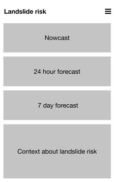
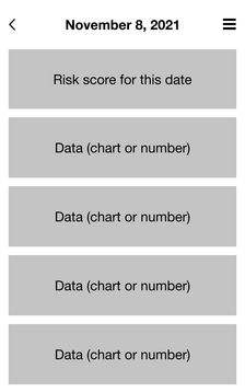
These concept designs helped our team align around a common vision early in the project. Not a complex dashboard, but a mobile-first experience that starts simple, with more details available for those who want to dig deeper.
Wireframing Across Scenarios
The homepage is the most important experience in the app—Sitkans will come back to this screen every day and use it to make important decisions. I explored many layouts and content flows to find the right approach. Some of the earlier versions were more explanatory—describing current and upcoming risk using larger blocks of text. Knowing that this application would be used regularly, I moved towards an approach that was more scannable, that placed higher value on information density.
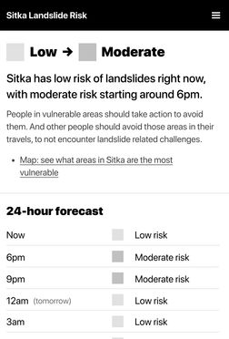
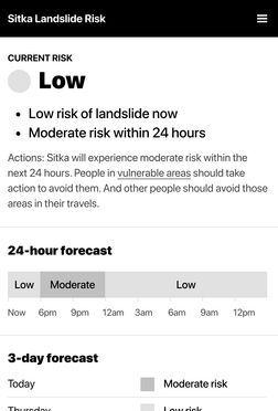

Iterations of home view wireframes progressing from more explanatory to more information density. Because we expect this to be an application Sitkans check every day, we prioritized information density.
One of the best practices our team adopted was to reduce information overload. To determine the correct type and amount of information to show, we needed to consider a variety of risk contexts. I defined three guiding scenarios for risks and intended responses: relaxed, worsening, and danger. In low risk scenarios, we can keep the interface simple. In a higher risk scenario, we can show more information about action steps.
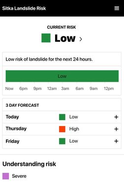
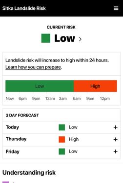
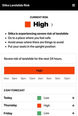
Home view variations meeting the needs of different scenarios: progressing low risk all day (relaxed), rising risk (worsening), and active risk (danger).
Visual Design
For the visual treatment of the app, I wanted to make sure the dynamic risk scores were the most prominent information on the page. The design should be simple, allowing Sitkans to focus on critical content. I used bold colors, including wide-gamut colors on supported devices, and common symbology to represent risk (checkmarks = good, and exclamation marks = warning). I relied on a System Font Stack instead of loading a custom typeface, prioritizing speed over branding.

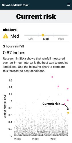
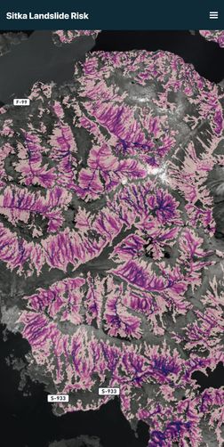
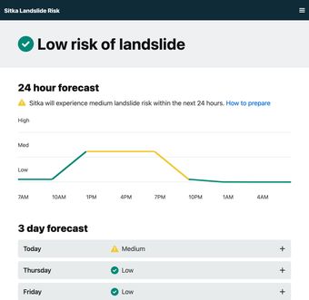
Final visual design mockups from a range of pages across the application, including the 3D elevation risk map.
User Testing: “Blue doesn’t make me feel calm”
After my first wireframe iteration, I conducted user testing sessions with 3 of the Sitkans I had interviewed. I built a clickable prototype using Figma and gave each participant a series of tasks to complete, representing common use cases, such as “you are planning a boating trip for this weekend” and “it’s Tuesday morning and you are getting your kid ready for school.”
When I introduce user testing sessions, I invite participants to think out loud. One participant looked at the homepage and had an immediate adverse reaction to the use of the color blue to symbolize low landslide risk:
Blue doesn’t make me feel calm. It reminds me of water, and our city has a history of tsunamis.
This feedback underscores the importance of testing. Without incorporating diverse viewpoints, I might have overlooked this insight about the color blue. I originally chose blue to avoid accessibility issues for users with red-green colorblindness. To address both issues, I switched from blue to green, but I made sure that the app always shows a text-based label in addition using color.
Building for Performance
Given the insights from the discovery process, I understood that this web app would often be accessed on the move—possibly during a boat ride or a hike with limited internet connectivity. Decisions regarding frontend technology had to emphasize performance. This was my first project using Next.js, selected because our team uses React for most of our applications, and Next.js allowed us to use React library to generate a static site.
By pre-rendering charts, adopting modern image formats like AVIF and WebP, and injecting critical CSS, I managed to achieve perfect Lighthouse scores in performance, best practices, and accessibility. Beyond scores, this ensures that Sitkans, whether at home or adventuring outdoors, can quickly access the latest landslide risk data.
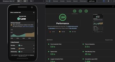
The application received perfect scores from the Lighthouse testing suite. The homepage can render, fully-styled, after downloading a single 8.1kB file.
Take a Look
You can view the finished application, which I designed and wrote all of the frontend code for. This application was featured on NPR's Short Wave Podcast.