TextureMap
Approximately 300 million people—or 4.5% of the global population—have a form of color vision deficiency. For these people, maps that depend on color to symbolize categorical data can be frustrating, if not impossible, to comprehend. TextureMap improves the accessibility of a map in minutes, without writing a line of code.
Client
My Role

At a Glance
- TextureMap is an R&D project that I imagined, designed, and implemented.
- I worked with a colorblind consultant to test and make improvements.
- I designed the marketing website and presented the work at a Mapbox "Lunch and Learn" webinar.

Reckoning with Map Accessibility
Like many in civic technology, I followed the Covid-19 vaccine rollout from a user experience perspective. I was upset to read about an accessibility issue with maps that prevented visually impaired people from scheduling vaccine appointments:
Their page is very accessible until you get to where you need to find the locations of the vaccines, and those are done like colored dots on a map
As a designer who specializes in map-based applications, this hit close to home. I have made a point in my own work to advocate for accessibility, but this article made me want to go a step further, to develop resources that can help everyone build more accessible maps.
Inspiration
I had recently read an article about how Trello introduced an optional colorblind friendly mode to their label system. Enabling this option added distinct patterns on each label, in addition to color, providing an accessible fallback. One of my colleagues pointed out that PageSpeed Insights had also moved to this kind of dual symbology. I wondered: could I bring a similar technique to web maps?
The library Textures.js solved a similar problem for the D3 graphics library. Unfortunately, for my purposes, it was not compatible with interactive map libraries like Mapbox GL JS, and it did not provide a solution for all geographic feature types.
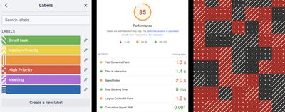
Accessible use of patterns and shapes to supplement color, which inspired my work on TextureMap. From left to right: Trello, Google PageSpeed Insights, and Texture.js.
Design
I identified the following opportunities:
- Support Mapbox GL JS: The resources should be compatible with Mapbox GL JS, which had become the default library for interactive maps at Azavea
- No plugin needed: If I could design this resource in a way that worked with the base Mapbox GL JS, that would decrease package size, make adoption easier, and would allow the resource to work in related applications such as Mapbox Studio
- Support all major feature types: Could I support not only polygons but also lines and points, covering the most common use cases?
- Neutral symbology: The patterns and shapes should not imply meaning (i.e., a red cross means hospital), but instead they should derive meaning through a legend; this will allow the symbology to effectively represent all categorical data
- Ten categories: I wanted to support up to ten categories for each feature type; ideally more
Polygons
To design patterns that would be compatible with Mapbox GL JS, I’d need to export them as SVG. I wasn’t able to find a vector-based tool for this particular use case, so my initial approach was to draw a graphic in Figma, export to SVG, and then load in Mapbox. This worked, but the feedback loop was slow, which limited my creativity.
And then, a breakthrough! I realized that I could use Figma’s component system, along with the newly released auto-layout feature, to build my own pattern tool that would reduce the feedback loop. My new pattern tool allowed me to make small adjustments to a pattern and see the results in real-time.
A pattern tool I built in Figma, using components and auto-layout, that helped me create and iterate on repeatable patterns.
Points
For accessible points, I designed a variety of visually distinct shapes. I avoided shapes with common associations, such as hearts and crosses, instead focusing on neutral symbols that could be used universally (Maki is a good resource for “point of interest” iconography, when a descriptive icon is a better fit). By adding a stroke color around the shapes, overlapping points will remain distinct, without appearing to merge together.
After I designed my first set of shapes, I imported them into Mapbox GL JS. I noticed noticed that while all of the shapes had the same height and width, I perceived some as larger than others. For example, a 14x14 square looked larger than a 14x14 circle. The variety of sizes made the visualization feel confusing, as if some points were more important than others. Just eyeballing it, I manually optimized each shape one at a time to find the right balance.
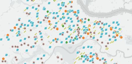
TextureMap points applied to a map of schools in Philadelphia. Note that the white border allows the shapes to overlap without blending together, allowing them to be used with dense data.
Lines
I saved lines for last because I knew they would be the most difficult. Mapbox GL JS provides few options for creating lines—you can change the color and width and add dashes. That didn’t appear to be enough variation to create 10+ visually distinct categories.
My solution: use what I call “compound lines”—multiple lines of the same color that appear to be a single styled line. For example, by stacking one thin brown line and a separate thicker brown dashed line, I built a line that looked like a train track. This opened up the door for many other line variations that were constructed using up to 4 separate line elements.
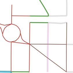
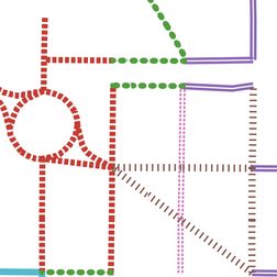
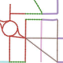
By overlaying lines with varying widths and dashes, I was able to create accessible lines. The first two screens show individual lines, while the third screen shows how they overlap to form “compound lines.”
User Testing
As a person who does not experience color vision deficiency, I performed an initial test of my work using Sim Daltonism to simulate different forms of color vision deficiency. From what I could tell, TextureMap was headed in the right direction. But before putting this resource out in the world, I wanted to validate my work with someone who is directly affected.
I hired a colorblind consultant, Robert Noorda, to participate in a user testing session and provide his expertise. A few key lessons from Robert:
- Repetition is key: The more often a pattern repeats, the better; design dense textures to increase the number of times they will repeat in a given polygon
- Aim for variety: Use shapes that are visually distinct; good: a circle, triangle, and square look relatively different; bad: a pentagon, hexagon, and octagon look relatively similar.
- Combine with interactivity: Robert finds it useful when hovering over a category in a legend highlights all matching features on the map
Sharing Knowledge
I want to encourage more map-makers to think about accessibility. I was honored to be invited by Mapbox to do a webinar about TextureMap as part of their “Lunch and Learn” series.
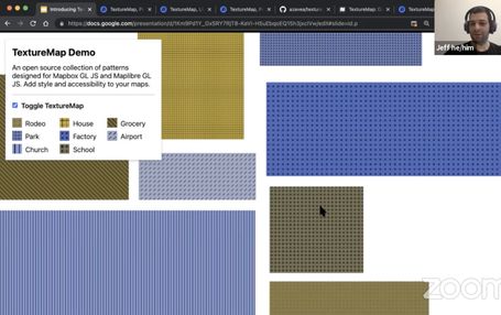
I gave a talk about TextureMap as part of Mapbox’s “Lunch and Learn” Twitch stream.
What’s Next?
There is still more work I want to do around map accessibility, specifically around making interactive maps more useful for people with limited or no vision. I led an Accessibility Working Group at Azavea to audit our existing products and build internal support for improving our practices.
Take a Look
TextureMap has a website, which I designed and built, and a GitHub repo.